Friday, 13 April 2012
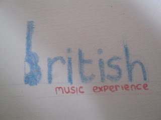
This logo was created with wax crayons and was a fairly simple idea but i liked it. The intent purpose was to make the B into half of a guitar therefore representing music . I noticed however apart from the blue it didn't say anything about Britain. As the b was supposed to look like a guitar it would have to be quite a solid colour so i wasn't quite sure what type of font I should use. I think i will develop this logo further in some way as it seems to be one of my favourites so far as it remains simple yet effective and relevant to the company it is for.I also tried a variant with the union jack being in the guitar area but it looked cheap again after that therefore I got rid of it and replaced it for solid colour.
Subscribe to:
Post Comments (Atom)


No comments:
Post a Comment