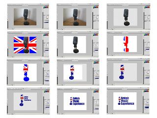
This was my final idea or what i thought was going to be it. I had another microphone with more detailing and that personally i thought looked nicer. It could also stand up nicely next to my text as it had a stand and was an upright microphone. I started my taking several images of it in what I believed to be a good position. I wanted the wire to be trailing away to leave it looking more electrical. When in Photoshop I drew around it with the pen tool and first of all deleted the background. Then i got a basic union jack flag from Google and placed it behind the microphone layer. I then created a new layer pressed Ctrl on the microphone and inverted selection and painted a white block all the way around the shape of my microphone on the empty layer. This was so once done i could still move the union jack around to get a good positioning.I then hid the actual microphone images and moved the union jack until it was in a position i was happy with once it was i merged the union jack and the white to create a single layer. I then changed the colours do a darker colour that I liked and turned the whole thing around so the wire part was running into where the text was going to be .I then got rid of the white again so i could position the logo exactly where i wanted it . The text i ended up using at first was coolvetica and was kind of happy with it but i hated the way the experience word stuck out really far therefore wanted to either shorten just that word replace it or do something different. After a while i decided to just go with BME which i did at first in the same font. After I realised the font didn't suit to be that big so i used a font called moderna and did it in all lower-case letters which looked much better. It then came to my attention that the block colours looked cheap and tacky which is why i decided to add a gradient and lighten the colours slightly. Just to finish off the logo i added the name underneath to finish it off. My mum then came in the room and when i asked her opinion she said "what's that shape though " so after asking a few more people and reev evaluating my options i decided to ditch the microphone idea altogether but i was really happy with the font which i intended to keep.
Saturday, 14 April 2012
This was my final idea or what i thought was going to be it. I had another microphone with more detailing and that personally i thought looked nicer. It could also stand up nicely next to my text as it had a stand and was an upright microphone. I started my taking several images of it in what I believed to be a good position. I wanted the wire to be trailing away to leave it looking more electrical. When in Photoshop I drew around it with the pen tool and first of all deleted the background. Then i got a basic union jack flag from Google and placed it behind the microphone layer. I then created a new layer pressed Ctrl on the microphone and inverted selection and painted a white block all the way around the shape of my microphone on the empty layer. This was so once done i could still move the union jack around to get a good positioning.I then hid the actual microphone images and moved the union jack until it was in a position i was happy with once it was i merged the union jack and the white to create a single layer. I then changed the colours do a darker colour that I liked and turned the whole thing around so the wire part was running into where the text was going to be .I then got rid of the white again so i could position the logo exactly where i wanted it . The text i ended up using at first was coolvetica and was kind of happy with it but i hated the way the experience word stuck out really far therefore wanted to either shorten just that word replace it or do something different. After a while i decided to just go with BME which i did at first in the same font. After I realised the font didn't suit to be that big so i used a font called moderna and did it in all lower-case letters which looked much better. It then came to my attention that the block colours looked cheap and tacky which is why i decided to add a gradient and lighten the colours slightly. Just to finish off the logo i added the name underneath to finish it off. My mum then came in the room and when i asked her opinion she said "what's that shape though " so after asking a few more people and reev evaluating my options i decided to ditch the microphone idea altogether but i was really happy with the font which i intended to keep.
Subscribe to:
Post Comments (Atom)


No comments:
Post a Comment